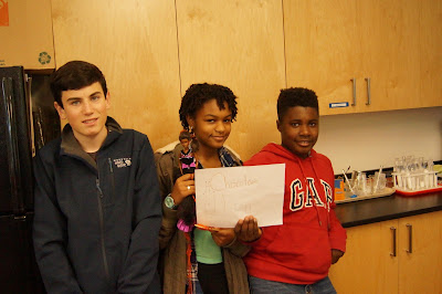
For the favorite ice cream flavor, topping, and container data, groups of students were asked to represent the data collected in a graphic manner. Students had to grapple with deciding which data to include, how to sort or organize the data so it was easier to consume, and which tool or strategy would best communicate the information. The diversity of representation was impressive. A small sampling is located below. Please stop by the upper hallway in the Athena building to take in the rest of the posters. We discussed how the same data set can be distilled in so many different ways. I hoped to illustrate that graphs and data sets can be helpful, but we must be careful to ask questions like: Which data was used? Which data was left out? What is the point of view that is being shared or promoted?
We will practice our observation skills and make sense of patterns and representations throughout the year as we make our way into algebra and algebraic thinking.


